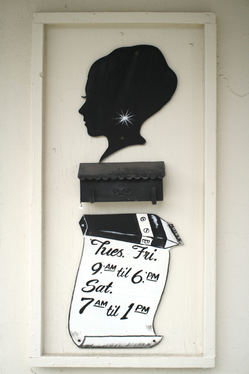
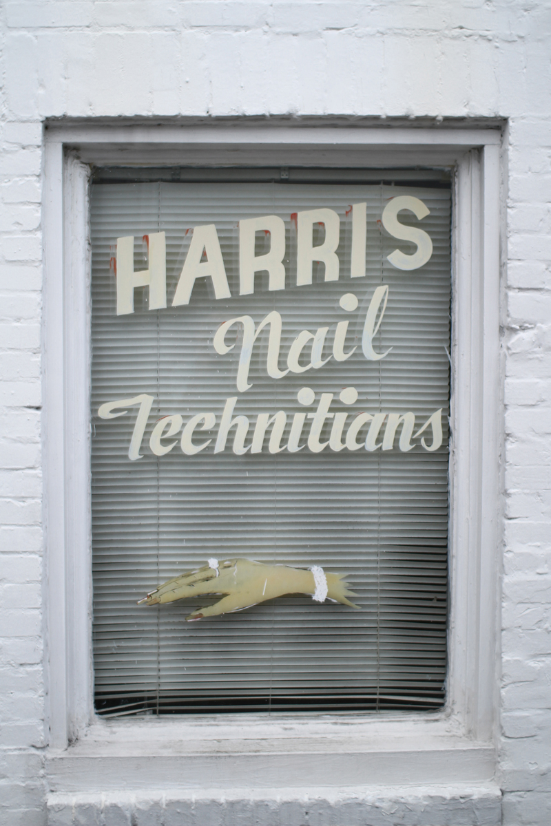
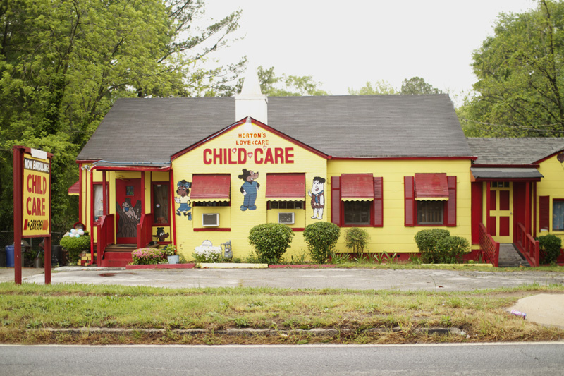
After photographing as many handpainted signs as I could find in Atlanta, I decided to do the same in Savannah. In the future I would like to hit all the Southern cities and eventually make a book. It was nostalgic for me to re-explore the city, as I spent three years in Savannah studying graphic design. As I was learning about and beginning to really explore design and typography, these were the most interesting examples around me that served as a backdrop and inspiration. Going back to Savannah, not much has changed. Most of the signs I remember vividly are still there, and there are many new ones. Most of these were taken from the West side of Savannah.
There are several characteristics of Savannah signage that makes it unique when compared to signage of other cities. Compared to Atlanta, and especially for its size, Savannah has many more signs. In Atlanta, they are much more spread out and scattered. You will find find a business with handmade signage every once in a while, few and far between the many chain stores. In Savannah there are whole communities and streets that feature predominately handmade signs. It feels like more a part of the culture there, where as in Atlanta the signs feel like remnants from the past. Perhaps the fact that Savannah is a small Southern town and that it has a reputation for crime curbed corporations' interests in putting chain stores in certain areas, thus keeping most of the stores locally owned and therefore with a unique style and character. Many of the Savannah signs are much more detailed and have many more components than those in Atlanta. You will often find a store with hand cut wood letters for the main signs - often with several parts in different fonts, handpainted images and signage on the windows, an overall matching color scheme of the whole building, and additional handcut wood signs attached to various parts of the outside of the building. It seems like because it is more relevant in the city, there are more people doing it, creating more competition to push the creativity and production work that goes into making the signs.


Another interesting characteristic is a certain typeface that is pretty common in Savannah, but that I have never seen in any other city. I used to think it looked almost like a pseudo-Chinese inspired typeface, like what you would see on a American Chinese Restaurant or a poster for a cheap American karate movie. I also remember thinking, when I was younger, that it had kind of a medieval or "Lord of the Rings" feel to it. This is somewhat evident in the two images below, in the house number in the first photo of this post, and there will be a few more examples in the next two posts.
Perhaps the style (especially in the "9" and "6" below) still has some remnants from Gaelic/Celtic type brought over by Irish immigrants? Savannah had a large Irish population at one point and even today has one of the biggest St. Patrick's Day Festivals in the world. A brief but interesting history of the relationship between Irish Americans and African Americans in Savannah can be found here:
http://www.pitt.edu/~hirtle/uujec/white.html and could explain how a cultural exchange could have happened after the Civil War. Whatever the influence, this style of type will always feel uniquely "Savannah" to me.
Also unique is the profusion of the "No Loitering" sign. These signs
are found on almost every block in some areas of Savannah, but I have never seen one
in Atlanta. (Interesting to note is that they are apparently also found
in Memphis -
http://www.geoffreyellis.com/memphis.html and possibly
other cities). It is often "signed" by the initials of the Savannah
Police Department and often accompanied by "No Drugs" (ironic
considering the dark history of members of the Savannah Police
Department participating in various drug trafficking rings in the 90s, a
few of which are covered here:
http://savannahnow.com/stories/091197/NWSofficersarrested.html). These
signs also allude to a long, complex, and often sad history of crime, poverty, crack cocaine, economic inequality, and violence in Savannah.
Savannah, like many American inner cities, was a totally different place
in the late 80s and early 90s. These "No Loitering" and "No Drugs"
signs remain as a strong reminder of that time.