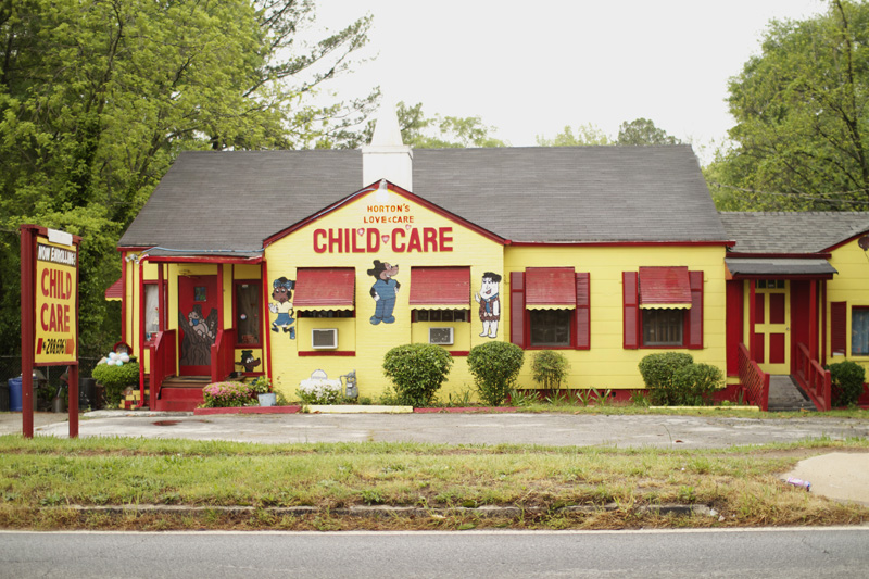
This final installment of Atlanta's handpainted signs is a bittersweet one for me, as I no longer reside in Atlanta. These images bring up a little bit of nostalgia in me, and they are a reminder of a culture that I am now far away from. New York definitely has its fair share of handpainted signs, but they are generally much more slick and refined, void of a style that feels like it developed in isolation from the rest of the world. They also lose so much of their power and mystique when they are just
one of many storefronts on a never ending block of buildings. Many of
these buildings in this and the previous posts are surrounded by nothing
but forest. You also lose a sense of the total building environment, with everything from the sides of the building, the front door, windows, and even the roof, not to mention the fence, front yard signage, and mailbox being a part of an overall design system.
A photographic study of New York signage was done in this book: Store Front: The Disappearing Face of New York, and thoroughly shows what would be more of an older New York City style of signage. The signs are more slick/refined, have higher production quality, and are less 'raw,' but still have a great deal of character.
One of the last apparent examples of the once ubiquitous design system for the Sock Man. As few as two years ago, you used to see trucks around the city with the iconic sock character and red and yellow type. There were also several storefronts, one of which was located on Glenwood. The identity was apparently developed by Trent.
One of the first handpainted signs that ever stuck in my mind, was this green street sign cut from wood. What really struck me was that all other signs around it, in the entire city in fact, are the standard government regulation green street name signs, with white type printed on a green metal rectangular. This sign roughly imitates the standard sign, and really makes you wonder how it came about. I have often wondered if maybe the original sign was damaged by a car, and the community could not get a timely response from the government for a new one to be made. Eventually someone just made their own, not caring whether it was a mechanically printed metal sign or a handpainted wood one, and it stuck. No matter what the reason, it shows a commitment and care of the people for the community in which they live, and also a refreshing sense of resourcefulness and independence.
Ad for a plumber, found on Candler Road. I love the tiny bear face above the 'n' in 'Plumbing'. Art done by local artist Kyle Brooks.


I like your collection of local hand-painted signs. I am glad you included my bears on Plumbing Man's signs. Thanks!
ReplyDeleteJust credited you under the photo with a link to your site. Thanks for the comment!
Deletethank you!!
ReplyDelete