Showing posts with label old. Show all posts

Tuesday, July 31, 2012

1920s German Girl Drawings

I came across this portfolio of drawings at an estate sale company's warehouse sale in Atlanta sometime within the last several years. The drawings really moved me, aside from the intrigue of being made in another country (Germany) from another time (1920s), they posses a certain sweet sadness, almost a longing for something, an emotion I normally wouldnt expect to see in a collection of children's drawings.

The drawings range from the fantastical to the observational. In the works of which people are the main focus, there is often a recurring subject of an "outsider" or someone who is generally aloof, or distant from the group of people (possibly representing "society"). From her drawings, one would guess that Marianne Falck was somewhat of an outcast around other children, perhaps she was picked on or teased at school. I have imagined that she never really felt like she fit in, and often ended up playing the role of the observer from afar. Several of the drawings offer time capsule-like views into 1920s German social life, with depictions of a group of fashionably dressed women walking, two party/carnival events, a group of young women nervously huddled together, and several children playing outside. But again, each of these scenes of social life is illustrated as if the artist was sitting in a dark corner of the room, recording the strange activities of these "normal" people, so easily able to fit in with society. Adding to this feeling of observation from afar is the attention to fine detail. With so much focus on the clothing and costumes, it feels as if the drawings were almost certainly done from direct observation. There is generally much more emphasis on the clothing of the characters than their faces, which are much less detailed and generally look pretty similar. This seems to emphasize that Marianne was interested in the strange rituals and behaviors of "normal society" more than the individual people themselves, which she found unrelatable and less interesting. But perhaps Im misinterpreting her work and viewing it through my own filter of the world, but thats just part of the fun of looking at art after all, isnt it?
The portfolio that the drawings were housed in. I sent this image to my good friend Michael Floyd, who happens to be a German language expert and he informed me that the text on the cover reads "Welusta Sketchpad: Manufactured by the Welusta Learning/Educational Material Publisher, W. & Louis Division, Kassel." Kassel is a fairly large (300 - 400,000 people), but quiet city in the middle of Germany about 1 1/2 hours from Berlin and Frankfurt.

Fairy tales also play a large role in several of her drawings. The city of Kassel (Were the sketchbook cover was manufactured, but where Marianne may or may not have lived) features a 18th century castle called the Lowenburg Castle, which was build in a medieval style, and may or may not have been a inspiration for the one featured in this drawing. It is also interesting to note that the Brothers Grimm collected and published most of their folk tales in Kassel.

This drawing is dated 1926. This was a very interesting time period in Germany. Only 8 years after World War I ended, 3 years before the American Stock Market Crash and Great Depression which would greatly affect Germany, and 7 years prior to the Nazis coming to power in Germany. The German revolution of 1919 (at the end of WWI) led to the formation of the Weimar Republic, Germany's first democracy. The Weimar Republic replaced the previous imperial government, and was in power from 1919 to 1933. This era in Germany was marked by political turmoil, financial hardhips, inflation, and massive unemployment. 1926, however was right in the middle of the "golden age" of the Weimar Republic, a sort of calm before the storm that lasted from 1924 to 1929. This period was known for relative growth in the economy, public support for the Republic, and great artistic and cultural innovation. The Bauhaus had just moved to Dessau and was still headed by Walter Gropius. Seeing these depictions of playing children and adults partying makes me wonder how different Marianne's art would have been in the course of the next several decades. What was her life like during the Third Reich? Was her family affected by the Great Depression? Was she aware of the Bauhaus, as it was less than 250 km from Kassel? Did she continue creating her art after her childhood?


Again I turned to my friend Michael for help deciphering this text. It's actually a Swiss poem written in German, and comes from the first one and a half stanzas from a poem by Gottfried Keller (A Swiss writer of German-language literature) called "Taugenichts" - or "good-for-nothing, n'er-do-well". The word generally refers to someone who rejects his/her family's traditional, hard-working ethic/profession in favor of an artistic or more self-fulfilling life. He also provided this "VERY cursory" translation:

The first violets were already awakened in the still valley;
A "beggar" placed his throne in the field for the first time.
The old man lay on his back,
The woman bathed by the lake
Dusty and unclean in the hedge melted
the last lttle pile of snow

The full moon threw its silver rays on the beggar's hands,
Strewed the woman with jewels,
The rags which she wore

Perhaps Mariann longed for the life of an artist, or at least was attracted to the romanticized ideal of the bohemian lifestyle.

This handwritten type in this drawing is Sutterlin, a modern style of German handwritten script that was designed by the graphic artist Ludwig Sutterlin in 1911. It was taught in all German schools from at least 1935 to 1941. For people outside of Germany, and most young Germans today, Sutterlin is almost completely illegible.


Monday, June 18, 2012

Handpainted Signs of Old Atlanta pt. 3 (of 3)

This final installment of Atlanta's handpainted signs is a bittersweet one for me, as I no longer reside in Atlanta. These images bring up a little bit of nostalgia in me, and they are a reminder of a culture that I am now far away from. New York definitely has its fair share of handpainted signs, but they are generally much more slick and refined, void of a style that feels like it developed in isolation from the rest of the world. They also lose so much of their power and mystique when they are just one of many storefronts on a never ending block of buildings. Many of these buildings in this and the previous posts are surrounded by nothing but forest. You also lose a sense of the total building environment, with everything from the sides of the building, the front door, windows, and even the roof, not to mention the fence, front yard signage, and mailbox being a part of an overall design system.

A photographic study of New York signage was done in this book: Store Front: The Disappearing Face of New York, and thoroughly shows what would be more of an older New York City style of signage. The signs are more slick/refined, have higher production quality, and are less 'raw,' but still have a great deal of character.  


One of the last apparent examples of the once ubiquitous design system for the Sock Man. As few as two years ago, you used to see trucks around the city with the iconic sock character and red and yellow type. There were also several storefronts, one of which was located on Glenwood. The identity was apparently developed by Trent.


One of the first handpainted signs that ever stuck in my mind, was this green street sign cut from wood. What really struck me was that all other signs around it, in the entire city in fact, are the standard government regulation green street name signs, with white type printed on a green metal rectangular. This sign roughly imitates the standard sign, and really makes you wonder how it came about. I have often wondered if maybe the original sign was damaged by a car, and the community could not get a timely response from the government for a new one to be made. Eventually someone just made their own, not caring whether it was a mechanically printed metal sign or a handpainted wood one, and it stuck. No matter what the reason, it shows a commitment and care of the people for the community in which they live, and also a refreshing sense of resourcefulness and independence.


Ad for a plumber, found on Candler Road. I love the tiny bear face above the 'n' in 'Plumbing'. Art done by local artist Kyle Brooks.


Wednesday, May 23, 2012

Handpainted Signs of Old Atlanta pt. 2 (of 3)

More signs from Memorial Dr, Glenwood Ave, Candler Rd, Moreland Ave, and Bouldercrest Rd. The first image is a hidden gem from a run-down, industrial stretch of Memorial, and features beautiful paintings of individual objects that were apparently for sale in the building at one point. Dont miss the six foot tall wrench in between the two doors in the second photo. Today it is apparently either out of business or used for something else.
 Atlanta Hand Painted Signs 01

Atlanta Hand Painted Signs 02

Atlanta Hand Painted Signs 03

Atlanta Hand Painted Signs 04

Atlanta Hand Painted Signs 05

Atlanta Hand Painted Signs 06

Atlanta Hand Painted Signs 07

Atlanta Hand Painted Signs 08

Atlanta Hand Painted Signs 09

Atlanta Hand Painted Signs 10

Atlanta Hand Painted Signs 11

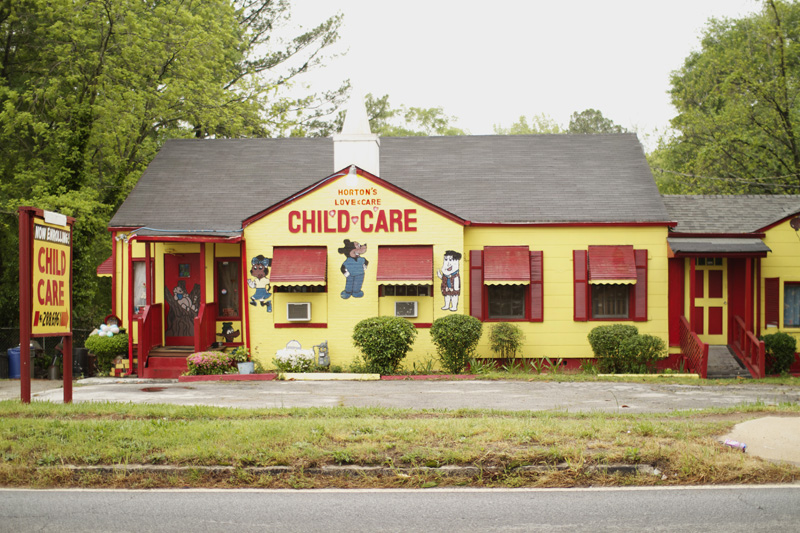
One of the best examples of the city's tradition of the fully adorned daycare center. Many daycares in Atlanta feature brightly painted exteriors, hand painted images of popular cartoon characters and other school/learning-related imagery, and large, bold, fun type. Prestigious features all these, plus the hand painted type seems to even continue into the interior, with 'Small Minds Big Achievements' visible inside the building on the photo. The funhouse mirrors as front windows add to the excitement, wonder, and toy-like quality of the building. I can only imagine anyone who attended this daycare would be left with such a strong and surreal memory of the place for probably their entire life.

Atlanta Hand Painted Signs 12

Atlanta Hand Painted Signs 13

Atlanta Hand Painted Signs 14

Atlanta Hand Painted Signs 15

Tuesday, May 8, 2012

Handpainted Signs of Old Atlanta pt. 1 (of 3)

I have been photographing handpainted signs in Atlanta for quite some time now, but not nearly as long as I have been noticing and appreciating their refreshing color schemes, startlingly original compositions, and hand painted letterforms. Like most cities in America, Atlanta has been slowly taken over by corporate chains and strip malls. This transformation, combined with advances in technology, has led to an endless sea of bland forgettable logos, painfully boring signs, and virtually unnoticeable storefronts, all designed by people in cities far away from most of the communities in which their work will be displayed. Where once stood - out of necessity - hand painted and hand assembled signs, now stand digitally printed vinyl banners, window clings, and 3d lettering seemingly available only in Helvetica. Safe corporate design now rules, and risks are rarely ever taken. And most disappointing of all, the elements of surprise and delight have all but evaporated in most modern signage.

However, there are still several pockets of complete individuality remaining in certain neighborhoods of Atlanta. For various reasons - most likely because of the economic level, demographics, and age of the area - corporations have not determined it worthwile to have a major presence in these areas. This has led to certain places maintaining a large proportion of independently-owned businesses, businesses that are not given a style guide to tell them exactly how their store should look. The owners of these businesses rely on a seemingly still-profitable industry of letterers and sign painters, which is all but dead in most other areas of the city. In Atlanta, these artists and designers have created a vast collection of work that represents the last remnants of a fastly disappearing regional design style. I have focused mostly on signs in Southeast Atlanta, just outside the city, where I feel the greatest concentration of these types of signs is. Most of these photos were taken on Candler Rd, Moreland Ave, Glenwood Ave, Memorial Dr, Bouldercrest Rd, and Jonesboro Rd.

The transformation that is taking place everywhere is neither good nor bad, it just simply is. Great design has always been created, and always will, regardless of technology or medium. There is of course a lot of incredible signage, branding, and storefront design made today by many talented designers across the world with new technology and printing/construction processes. To call for a return to the old ways would be nostalgic and futile, and to refer to these signs as 'bad' or dismissible would be just as equally inaccurate. In fact, most of these signs would be considered 'good design', if there is such a thing. They fulfill their function of clearly indicating what exactly the store or business has to offer to the public, and they do this in a creative, surprising and arresting way. Not only that, but they also retain the ability to attract the viewer's attention while simultaneously remaining relatively simple and straightforward.

Atlanta Hand Painted Sign 01

Atlanta Hand Painted Sign 02

Atlanta Hand Painted Sign 03

Atlanta Hand Painted Sign 04

Atlanta Hand Painted Sign 05

Atlanta Hand Painted Sign 06

The only artist that leaves any indication of his name on his work is a painter that signs his name simply as 'TRENT'. Trent has a very individual style and his work can be identified by his signature use of bright primary colors, large letters cut from wood in one of several personal typefaces, and a strange technique he sometimes uses of 'dusting' letters with a glitter that sparkles in sunlight (as can be seen above in '$50 WEAVE'). He is also probably most well known for his design and painting of the Sockman icon, which was visible in several locations throughout Atlanta for many years, but now is much harder to find. Trent is one of the most creative, playful, and prolific sign painters in Atlanta, and I will feature much more of his work in future posts.

Atlanta Hand Painted Sign 07

Atlanta Hand Painted Sign 08

Atlanta Hand Painted Sign 09

Atlanta Hand Painted Sign 10

Atlanta Hand Painted Sign 11

Atlanta Hand Painted Sign 12

Atlanta Hand Painted Sign 13

Atlanta Hand Painted Sign 14

Above and Below: Notice the images simplified down to pictograms, describing exactly what goods/services are offered inside. The store's offerings are clear even to someone who is swiftly driving by and only has the chance to glance at the sign without reading any text. The sign would also be completely readable to the illiterate or people who cannot speak English.

Atlanta Hand Painted Sign 15

This post is the first of three installments of handpainted signs in Atlanta, and the photographs constitute one third of the photos I have taken. I think it is important to document these signs, as they are becoming more and more scarce and will possibly eventually disappear completely. I would love to see what handpainted signs look like in other cities in other regions of the country, and especially in other countries. Ive seen many beautiful images of signs from other countries painted in a folk-art style, and I lived in Savannah, Ga for several years and vividly remember the city having its own distinct style of hand lettering. Feel free to leave a comment with a link to images or send me an email of signs in your area.

I do want to point out that there is a new resurgence of popularity for handpainted signs. This resurgence is aligned with the trends of food trucks, 'farm-to-table' dining, the indie craft movement, and the overall general enthusiam for referencing old typefaces and old ways of doing things. The current zeitgeist is one that seems to be longing for the past, a nostalgia for a misremembered time ago. This has led to handlettering and a multitude of handpainted signs for trendy clothing stores, overpriced bars, and upper class restaraunts. These types of handpainted signs have not been showcased here, as I feel they have already been over-documented by design blogs, designer portfolios, reference sites, and various other online outlets. The main reason the above signs are so fascinating to me is because they are not just aesthetically nostalgic nods to the past, but instead vital, living, breathing, and relevant necessities of the businessmen and enterpreneurs who require their functioning design.